We are all sick.
Did I say.. sick?
Yes I did!
Oh..Really? Is it so..What kind of sickness?
Nature created us for two reasons survival and growth of race, it seems to be the way with every other species.
So? what it has to do with sickness? Man seems to be doing a good job.
Oh yeah.. man seems to be doing a good job, but not as good as other animals.
What? Do I mean other animals are doing better than man. I must have lost my mind.
That's it, that's the sickness I'm talking about.
What? Do I mean man has gone crazy?
Yeah, in a way. Man would have done a great job, but he got infected.
Infected with what?
With emotions! He started to feel things other than survival and growth of race.
He started feeling Love, Hate, Pride, Grief and it let everything to this imbalance. Every other species tries to maintain equilibrium, they eat, sleep, reproduce, do everything in balance. They don't kill each other until and unless to survive or to reproduce.
I guess I am right, everything man does just makes the situation more worse. Man is destroying this beautiful Earth which otherwise would have been much more beautiful than it is now. We are destroying everything. We all really are sick.
Tuesday, January 27, 2009
Tuesday, January 20, 2009
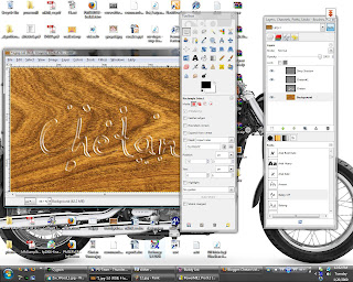
Cool Water Text Effect
Another GIMP Tutorial :D
Following tutorial is to create a water text effect.
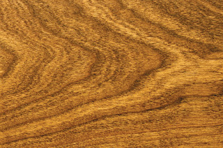
A quick google search got me the following image of a wood surface on which we will add our water text effect.
This is what I got finally
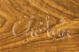
image size: 1024x678
GIMP version - 2.6.2
Following are the steps that I followed
1] Open image in GIMP.
2] Add a new text layer and add text in white color with some hand-writing font so that it looks more realistic.
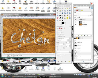
3] Take a white brush and paint some spots that we'll turn into water drops like the following image:
4] Set layer size to image size.
5] Duplicate the layer with text (Lets call them t1 and t2).
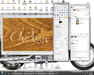
6] Right click on layer 't2' in layers dialog and select 'Alpha to Selection'. This would select the non transparent region.
7] Switch to channel window and add a new channel. Set channel opacity to 100, and tick 'Initialize from Selection' option. Now deselect all and blur the channel three times with blur raius as 7, 4, 1. Then hide the channel.
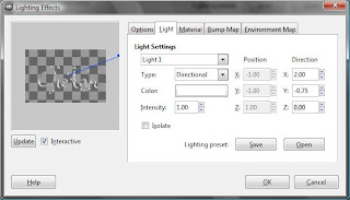
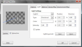
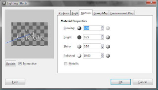
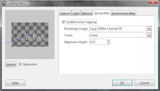
8] Now we will add some lighting effect to the layer 't2' using the channel we created as bumpmap. You can use following settings:
After applying the changes you must have something like this:
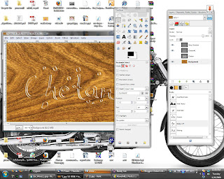
9] Select layer 't2', Lock the alpha channel (this option is towards top of the layers dialog), then blur the layer with blur radius as 4px. Unlock the alpha channel.
10] Select Colors | Color to Alpha, and choose a mid gray color. This should give you something like this
11] Now we will add some shadow to give a little more realistic look. Right Click on the 't1' layer and select 'Alpha to Selection'. Drop a shadow offset to x:-2, y:1 and alpha set to 50%.
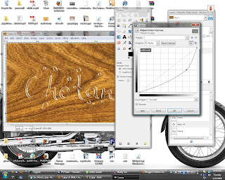
12] There is too much *white* in the image, select the 't2' layer, Colors | Curves, select channel as Alpha and slightly move the curve downwards till you have something like this:
13] We are almost done, just need to add a slight refraction effect. Select layer 't1' and again make a selection from alpha. Now select the wooden surface layer (keeping the selection). Select Filters | Distort | Whirl and pinch, set angle to 60, radius to 2. Select Filters | Distort | Lens Distortion, Set Main:-25, Zoom:2.
14] Done!! This is what I have finally:
Following tutorial is to create a water text effect.
A quick google search got me the following image of a wood surface on which we will add our water text effect.

This is what I got finally

image size: 1024x678
GIMP version - 2.6.2
Following are the steps that I followed
1] Open image in GIMP.
2] Add a new text layer and add text in white color with some hand-writing font so that it looks more realistic.
3] Take a white brush and paint some spots that we'll turn into water drops like the following image:

4] Set layer size to image size.
5] Duplicate the layer with text (Lets call them t1 and t2).
6] Right click on layer 't2' in layers dialog and select 'Alpha to Selection'. This would select the non transparent region.
7] Switch to channel window and add a new channel. Set channel opacity to 100, and tick 'Initialize from Selection' option. Now deselect all and blur the channel three times with blur raius as 7, 4, 1. Then hide the channel.

8] Now we will add some lighting effect to the layer 't2' using the channel we created as bumpmap. You can use following settings:


After applying the changes you must have something like this:

9] Select layer 't2', Lock the alpha channel (this option is towards top of the layers dialog), then blur the layer with blur radius as 4px. Unlock the alpha channel.
10] Select Colors | Color to Alpha, and choose a mid gray color. This should give you something like this

11] Now we will add some shadow to give a little more realistic look. Right Click on the 't1' layer and select 'Alpha to Selection'. Drop a shadow offset to x:-2, y:1 and alpha set to 50%.

12] There is too much *white* in the image, select the 't2' layer, Colors | Curves, select channel as Alpha and slightly move the curve downwards till you have something like this:

13] We are almost done, just need to add a slight refraction effect. Select layer 't1' and again make a selection from alpha. Now select the wooden surface layer (keeping the selection). Select Filters | Distort | Whirl and pinch, set angle to 60, radius to 2. Select Filters | Distort | Lens Distortion, Set Main:-25, Zoom:2.
14] Done!! This is what I have finally:

Friday, January 16, 2009
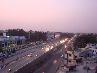
Add colors to your pics : Lomo Effect
While browsing through some photoshop tutorials, I came across 'Lomo Effect'. There seem to be lot of Photoshop tutorials to add lomo effect to your pictures, so I thought to write one for GIMP.
I used GIMP 2.6.2
image resolution 1024x768
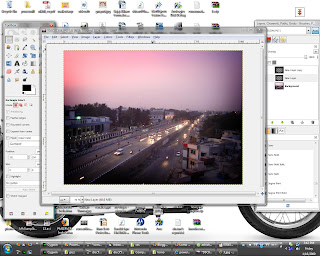
Original image
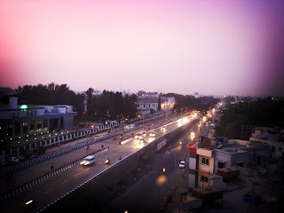
Final image
1] Open your image in GIMP.
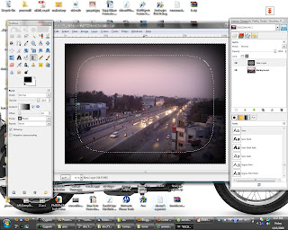
2] Select whole photo using 'Select | All'
3] Shrink the selection by 75 pixels (Select | Shrink)
4] Feather the selection by 300 pixels (Select | Feather)
5] Invert the selection (Select | Invert)
6] Create a new transparent layer and select it
7] Take the gradient tool, set shape to 'Radial', and add a white to black gradient from center of phot to the bottom side. You must get something like this:
8] Set the gradient layer mode to overlay.
9] If the border looks too dark, reduce the opacity of the gradient layer or ifs less dark then duplicat the gradient layer (make sure the duplicate layer is also set to overlay mode). I got the following result after duplicating the layer.
10] Flatten the image (Image | Flatten Image)
11] Open the Color curves dialog (Colors | Curves), set channel to values and apply an 'S' curve, something like this:
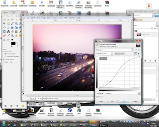
12] Apply the changes.
Done!!
I used GIMP 2.6.2
image resolution 1024x768
Original image

Final image

1] Open your image in GIMP.
2] Select whole photo using 'Select | All'
3] Shrink the selection by 75 pixels (Select | Shrink)
4] Feather the selection by 300 pixels (Select | Feather)
5] Invert the selection (Select | Invert)
6] Create a new transparent layer and select it
7] Take the gradient tool, set shape to 'Radial', and add a white to black gradient from center of phot to the bottom side. You must get something like this:

8] Set the gradient layer mode to overlay.
9] If the border looks too dark, reduce the opacity of the gradient layer or ifs less dark then duplicat the gradient layer (make sure the duplicate layer is also set to overlay mode). I got the following result after duplicating the layer.

10] Flatten the image (Image | Flatten Image)
11] Open the Color curves dialog (Colors | Curves), set channel to values and apply an 'S' curve, something like this:

12] Apply the changes.
Done!!
Friday, January 2, 2009
Be a sketch artist
Once I was searching for GIMP tutorials to convert a photograph to a pencil sketch. Almost all tutorials I found used same technique which I think can be roughly summarized as finding edges in the image and inverting the colors. Though the results were fine they seemed to lack something, and then I thought of adding the diagonal pencil strokes.
I used GIMP 2.6.2 and a 1024x768 sized image.
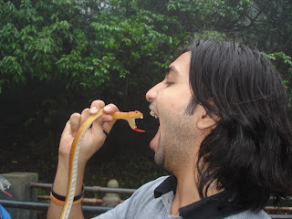
Original Image:
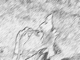
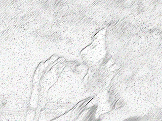
Final Image:
Following are the steps (including the ones I learned from other tutorials)
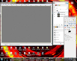
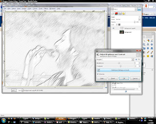
1] Open the image in GIMP
2] Duplicate the layer
3] Gaussian blur the top layer. I used the blur radius as 5 pixels.
5] Invert colors of the blurred layer, and set its transparency to 50%.
6] You should have something like this.
7] Merge down the top layer.
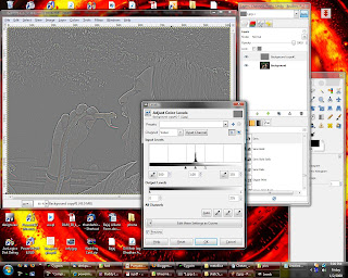
8] Open colors | Levels, set the minimum and maximum input levels as 100 and 155 as below.
9] Desaturate the layer
10] Open Colors | Levels, adjust the input levels so as to get something similar to the following
11] Now Duplicate this layer. Hide the top layer and select the second one.
12] Select Filters | Blur | Motion Blur. Select blur type as Linear, length as 10 angle as 135. Repeat motion blur with angle changed to 315. You should get something as:
13] Unhide the first layer set its transparency to 20%. Merge down the top layer with the blurred layer.
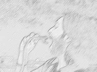
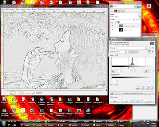
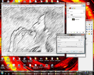
14] Select Colors | Contrast. Increase the contrast slowly till image looks more like a pencil sketch. I increased the contrast to a value of 15, to get the following result
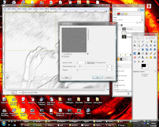
15] Now we need to add some more random pencil strokes. Add a new transparent layer of size 512x384 i.e. of half width and height of the image.
16] Select Fileters | Noise | Hurl. Select a random seed. Set randomization% to 10 and repeat to 1. This should add some random dots to the layer.
17] Select Layer | Scale layer. Scale the layer to image size select interpolation as cubic. Move the layer if necessary to overlap the image correctly. You will have something like this
18] Select Colors | brightness and Contrast. Set Brightness to minimum and Contrast to maximum.
19] Now again apply motion blur on this layer as previously. But keep the length as 20.
20] Again merge down the blurred layer.
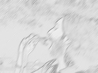
21] Now, Select Colors | Brightness-Contrast. Reduce the brightness and increase the contrast to get something like this:
22] Now you can apply canvas from Filters | Artistic | Apply Canvas, to give it a more realistic look. Here is the final image that I got after applying canvas:
Done!!
I used GIMP 2.6.2 and a 1024x768 sized image.
Original Image:

Final Image:

Following are the steps (including the ones I learned from other tutorials)
1] Open the image in GIMP
2] Duplicate the layer
3] Gaussian blur the top layer. I used the blur radius as 5 pixels.
5] Invert colors of the blurred layer, and set its transparency to 50%.
6] You should have something like this.

7] Merge down the top layer.
8] Open colors | Levels, set the minimum and maximum input levels as 100 and 155 as below.

9] Desaturate the layer
10] Open Colors | Levels, adjust the input levels so as to get something similar to the following

11] Now Duplicate this layer. Hide the top layer and select the second one.
12] Select Filters | Blur | Motion Blur. Select blur type as Linear, length as 10 angle as 135. Repeat motion blur with angle changed to 315. You should get something as:

13] Unhide the first layer set its transparency to 20%. Merge down the top layer with the blurred layer.

14] Select Colors | Contrast. Increase the contrast slowly till image looks more like a pencil sketch. I increased the contrast to a value of 15, to get the following result

15] Now we need to add some more random pencil strokes. Add a new transparent layer of size 512x384 i.e. of half width and height of the image.
16] Select Fileters | Noise | Hurl. Select a random seed. Set randomization% to 10 and repeat to 1. This should add some random dots to the layer.

17] Select Layer | Scale layer. Scale the layer to image size select interpolation as cubic. Move the layer if necessary to overlap the image correctly. You will have something like this

18] Select Colors | brightness and Contrast. Set Brightness to minimum and Contrast to maximum.
19] Now again apply motion blur on this layer as previously. But keep the length as 20.
20] Again merge down the blurred layer.
21] Now, Select Colors | Brightness-Contrast. Reduce the brightness and increase the contrast to get something like this:

22] Now you can apply canvas from Filters | Artistic | Apply Canvas, to give it a more realistic look. Here is the final image that I got after applying canvas:
Done!!
Subscribe to:
Posts (Atom)